I’ve heard that it takes a village to raise a child. I don’t know about that, but in the past year I have learned this: it certainly takes a village to make a book.
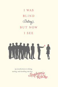
I’m thrilled to be sharing something exciting with you today: the cover for my memoir, I Was Blind (Dating), but Now I See!
Since I work in book publishing, I have an inside peek into some of things that happen to turn a bunch of typed-up words into something you can hold in your hands. But until it was my own book, I don’t think I had a true appreciation for the creativity, teamwork, and sheer hard work that go into making that a reality.
I have been amazed and grateful for all the good people at Tyndale who have taken the humble Word document I gave them and metamorphosed it into something lovely—with a charming illustration on the front, pretty fonts, little spots of shiny foil, a texture-y cover, and nice paper.
There are so many people to thank for their role in the whole process (please check out the acknowledgments at the back of the book!), but today I want to give you a sneak peek into how my amazing designer, Jackie, created the cover for the book.
First, my book team sent me a survey about my vision for the cover. Alas, I have practically zero skills when it comes to all things design-related, so I threw around a lot of words to describe what I wanted it to feel like. Fortunately Jackie was able to translate my thousand words into a single picture, and she captured the exact tone I was looking for. The truth is, I didn’t know what I was hoping the cover would look like until I saw it.
Here’s how Jackie came up with the design. First, she read the manuscript. Then she and a handful of other designers brainstormed cover possibilities and sketched them out. After all the designers gave feedback, they narrowed it down to their top three and presented them to the book team. Then the book team chose their favorite (which just so happens to be my favorite too).
Once the cover direction was chosen, Jackie found an illustrator to do the sketch. This will give you an idea of how much attention she pays to detail: she actually sent the illustrator a photo of me so the sketch would be as accurate as possible. (I should note it’s not entirely accurate, however, because I could only dream that my hair would look so good in real life.) She even gave the illustrator suggestions about what the guys might look like based on the descriptions in the book. (For all your former blind dates out there, please note that the silhouette format will protect your identity, so there’s no need to contact your lawyer.)
Credit also goes the talented Sarah Parisi, who created StephanieRische.com and my logo, which serves as the byline on the cover. She’s also a gifted photographer, and she took the picture of me on the back cover. I’m grateful for her creative eye and expertise that helped launch this adventure in earnest two years ago.
If you would like to see the beautiful cover in person, you can order it online, or you can come to a book signing on Saturday, February 6, at 2:00 at the Barnes and Noble in Geneva Commons. (I will be the one up front wondering how this introvert found herself reading mortifying clips about her dating life aloud in a public place.)

